The Initial Concept...
"Although we are each a whole body and mind in one, it’s interesting to take it down to the abstracted level. Multiplying cells, cells in flux, cells in cycle. The experience of being an organism, a consciousness barely separated from the world around it, and of being a changing creature in a changing species (in a changing world in a shifting universe…)"
This initial writing still stands! My key words for the project have been repetition, replication, mutation and adaptation.
Sensory Maps, CMYK, and Cubes...
The palette for this project is CMYK; cyan, magenta, yellow, and black. In the CMYK halftone printing, these tones are printed in layered, slightly offset dot matrices. Used in combination, they can simulate the entire visible colour spectrum. I like this as an example of 'particulate whole'.
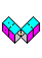
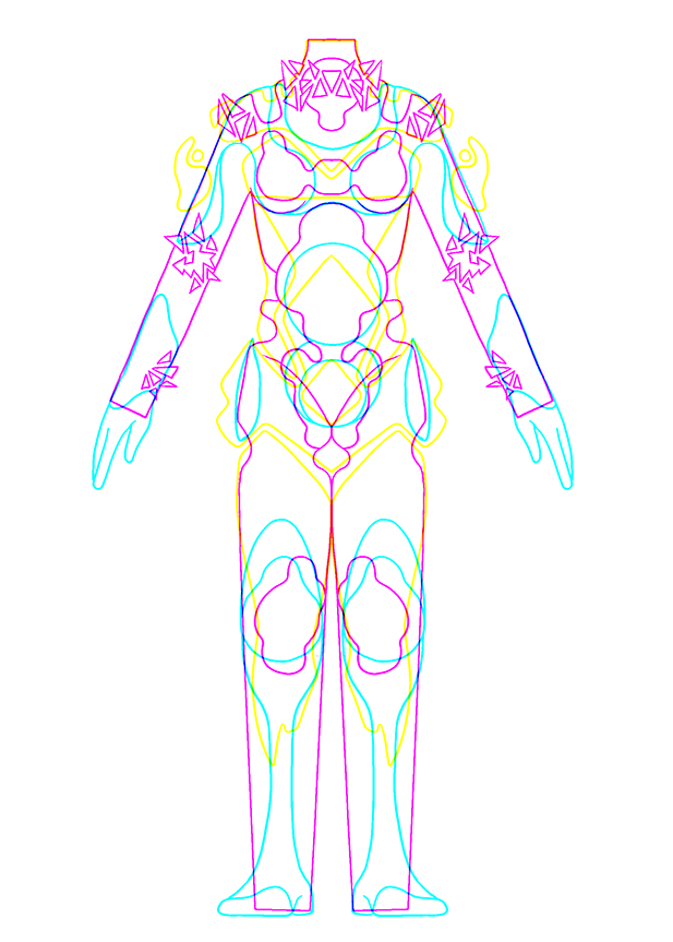
To further explore this concept I created intuitive sensory maps and planned out an adaptive 3D form – that's where the cubes come in. The 1x1 swatch is a flat pattern of the modular cube form and can be prompted to take such shapes.
I created a few concept art pieces to explore the topic. This image combines my sensory maps in CMY. Where the lines overlap they create RGB :).
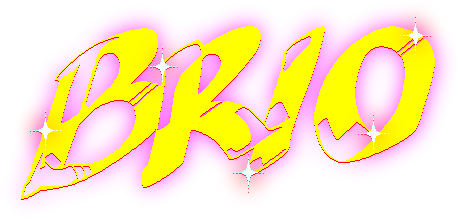
"But Bri, it doesn't look CMYK!"
Material Choices...
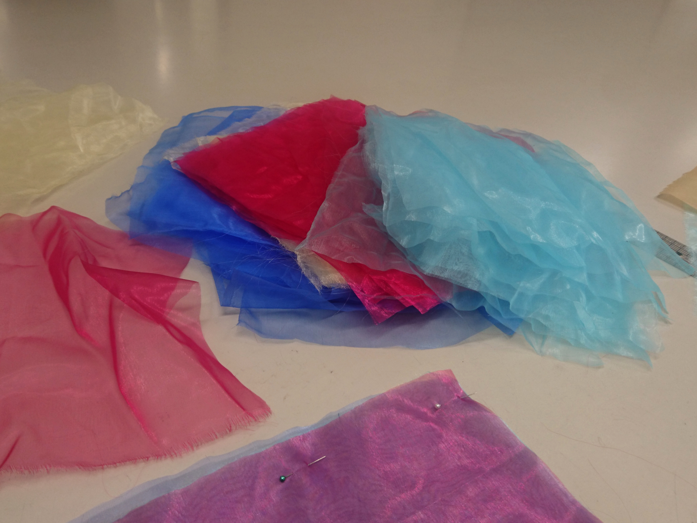
I gathered up an amount of material in cyan, magenta, and yellow. It might be a surprise, but I did actually have a decent amount of material available in these colours, and I fully intended to use them...


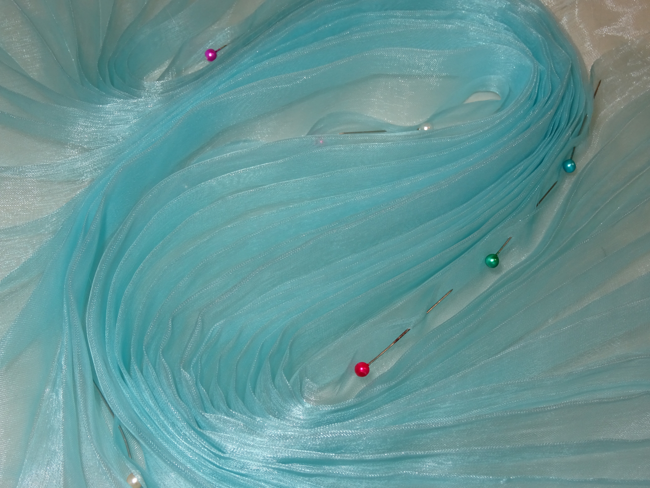
However! Two of my chosen materials, in cyan and yellow, were this particular gauzy fabric. We have had a bag of these swathes of fabric in the cupboard for like, 10 years. As my ideas came together I realised it would be really cool and effective to have layers of this translucent material. I felt like the softer, emerging palettes and the visual moiré of the layered materials exemplifies the CMYK halftone dot matrix and the effect of creating new colours from a limited selection. Perfect!! I had cyan and yellow, and I opted to substitute the magenta tone with the available reddish-fuschia. I did not have this material in black, but I felt that 255 Blue was a good replacement.
Initially I wanted to use narrow pleats in organic forms reminiscent of fingerprints.
This was an earlier trial experimenting with ways to reinforce the cube form.
Constructing the Squares...
The trial square below guided the rest of the project. Despite my fondness for the pleating, I felt that the reverse appliqué was stronger without it. The strict square form didn't make good use of the flexibility afforded by pleats, so I will have to find another use for pleats elsewhere... I still want to experiment more with them!!

Well, although I removed the repetitive visual element of pleats, I can say that the construction process itself definitely embodied the spirit of replication and cell multiplication. Creating 16 squares with 4 layers each means 64 squares of fabric...! These were 30 x 30 cm each, so that after aligning and trimming and sewing and inverting they'd be 27 x 27 cm.
Reverse Appliqué...
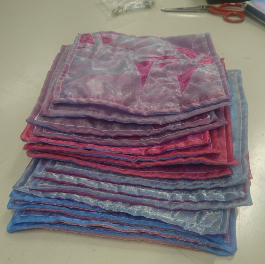
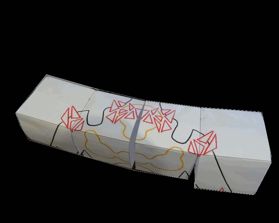
Sewing and sewing and sewing my 16 squares. There was something satisfying about piling them all up in the end. I like the look of the bicolour edges, revealing that the underside presents a different array of colours due to the reversed layer order. For the reverse appliqué imagery, I printed out a 1/5th scale sensory map divided by a grid, and recreated it on the fabric with pen. As the fabric is being cut away, I did not worry about pen marks. In the end I chose the sensory map which represented vulnerability and irritation. This map speaks to minute nervous system and mental processes, but honestly I chose it because I liked the geometric forms the most! As a bonus, I then got to make a cube form with the paper guide.
Reverse Appliqué (Continued)...
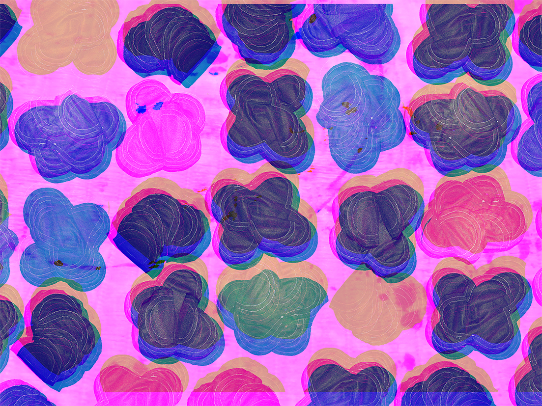
The first row of squares are layered, from the top down, CMYK. The next row is MYKC, then YKCM, then KCYM. The centremost parts of the design have 3 layers removed, while the 'body' has 2, and the triangular motifs have 1 layer removed.
As the cyan and yellow are both quite pale, with the red and blue being much stronger, the overall effect is of a purple swatch. The background makes a difference, though, and some surfaces bring out different tones more. I have to say I actually really like this incidental shot of the squares on wooden flooring, where the warm tones came out more than usual!
I do not mind that the result is more vague than my strict CMY concept art would suggest. I think there is a lovely, hard-to-place nuance in the emergent colours; although they all seem kind of red, kind of blue, kind of purple, there is something just subtly 'different' about each of row of colours. I like that the underside has it's own palette, too, which is part of the reason why I ended up attach the squares to one another with their bicolour edges facing outward.
Don't ask me about thread colour, I know, I know. On the day I started the top-stitching, I actually got to campus and realised I had somehow forgotten my entire sewing kit...! Thankfully the technicians are very generous and they took pity on me, so I was able to sew that day. But I didn't have my coloured threads with me, and so I used white. That's that!
Cube Saga...
When I started on the final direction, I was intending to add a fifth layer to each square that would act as like a 'pillow slip' so that the cardboard backing could be added and removed. I wanted the cardboard removable so that the flat form would be flexible, just because that seems fun. But I didn't like the idea of this fifth layer messing with the 4-colour effect or showing through when the cardboard wasn't in there, so I decided instead to affix the cardboard another way.
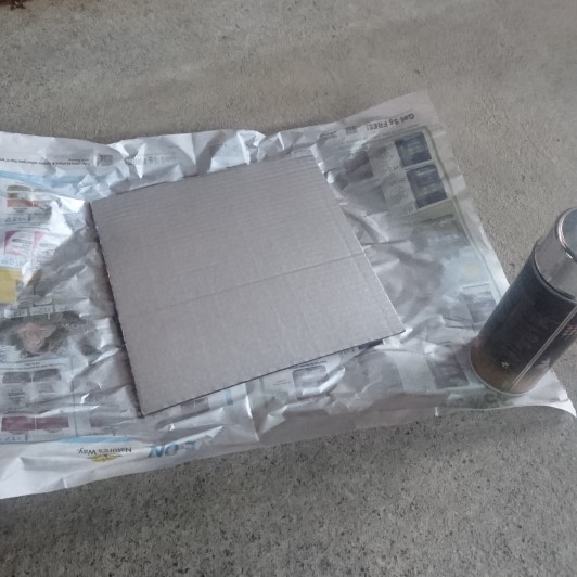
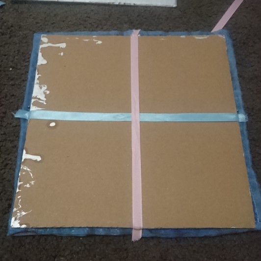
I tried a few ways of using ribbons and such, by pinning them across the corners so the cardboard could slip in, or at the sides, or tying them through the cardboard itself. I had my 25 x 25 cardboard squares, and I even spray painted them metallic silver so that they would provide a nice backdrop for the layered fabric. Tying through the cardboard seemed effective, so I prepared a bunch of strips of calico to make it happen. But then, after I sewed up the first one of these... it just looked bad!! My ribbon trials had been misleading.
Although cubes were one of the central idea of this project, well it was becoming a bit more hassle than it was worth to me. However, the swatch is still sewn in such a way that you can make (floppy) cubes with it, hehe. I have some press studs to optionall close the non-sewn edges that need to be closed for it to constrict into a folded shape. But, I only had a few press studs, not enough to more thoroughly seal the edges, so for the image development I reinforced these closings with pins.
Spray painting the cardboard...
An unsuccessful ribbon test. It's not very effective to hold it at the sides only.
It's better to affix at the corners.
I was so ready to attach 64 ribbons...
Image Development...

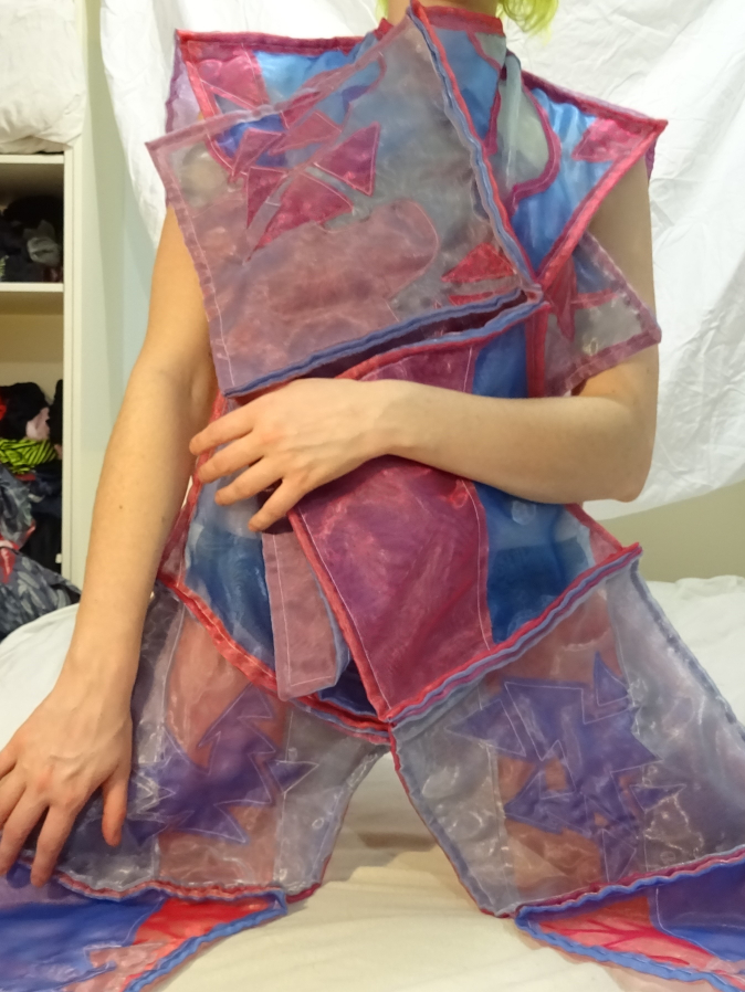
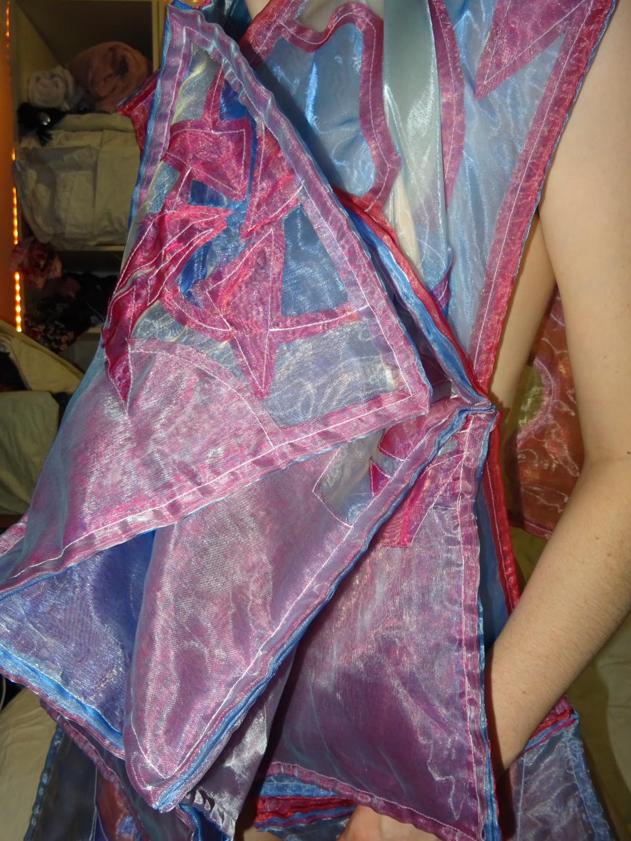
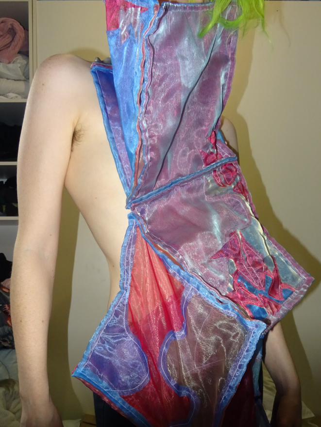
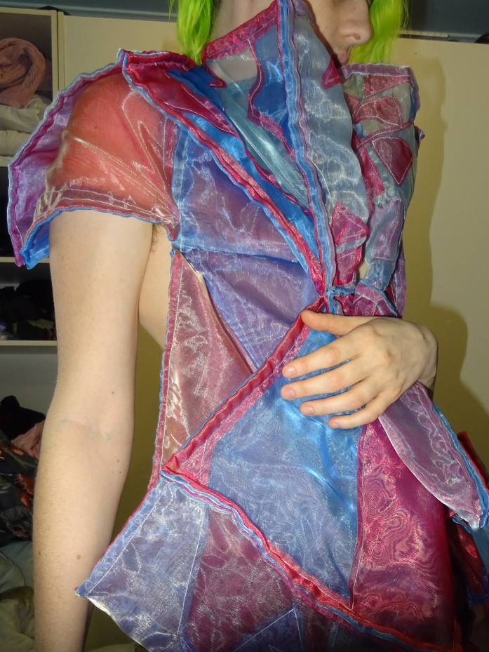
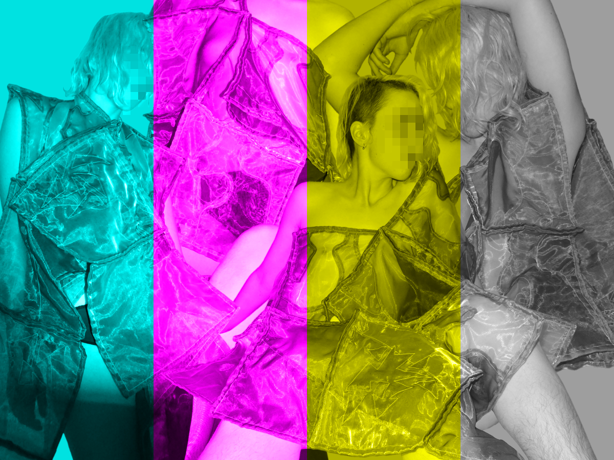
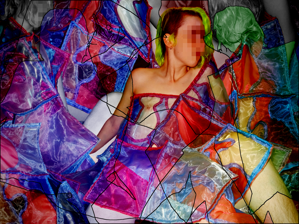
For my final imagery, I took the photos myself, as both model and photographer. This was a bit of a hassle, but that's what I get!! I had a lot of fun draping the swatch or folding it up. This was my favourite photo from the shoot even though it's blurry and I'm making a dumb face :) I just like it.
I thought the transparent swatch would be most effective on a mostly nude form, I think this connects the cellular and conceptual swatch with its 'reality', that is a human body! For the editing, I felt like collaging many photos would best demonstrate the ideas of modularity and multiplicity, however I did present one photo on its own to give a more clear visual of the swatch in a relaxed state draped over the body. I had a lot of fun editing, most apparent in the collaging, but I did also give it some minor tweaks and colour balancing.
I do think I could have used images that show the more structured and folded forms, but honestly many of those photos kind of sucked, such are the limitiations of taking a photo on a timer and then arranging the garment around yourself!! Although the most apparent editing is the collaging and face-blurring, I did also do minor tweaks and colour balancing. Some of the edits got a bit wilder, but I decided to rein them in for clarity of visual communication. See below for some of the photoshoot outtakes and alternate versions of the final images!
back up top